Rates as of 05:00 GMT
Market Recap
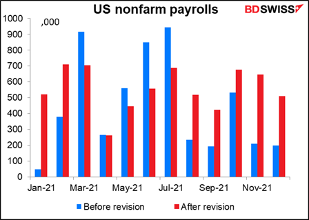
I’ve frequently argued that the ADP report is an unreliable guide to nonfarm payrolls, but even I didn’t think it was that unreliable! Payrolls stunned the market with a rise of 467k vs estimates of only 125k. The forecast on Bloomberg ranged from -400k to 250k, so this was almost double the highest forecast in the market. (I have to admit, I expected payrolls to fall after the ADP report fell by 301k.) Moreover, the previous month was revised up to 510k from 199k.
(We can’t be too hard on the forecasters, though. Every year in January the Bureau of Labor Statistics revises its assumptions and its seasonal adjustment process. With the benefit of 2021’s data in hand, the seasonal adjustment figures were revised sharply. Under the previous seasonal adjustment figures the NFP would have been up just 31k.)
Not only isn’t the ADP report a good forecaster of the NFP figure, but also the initial NFP isn’t a good forecaster of the final NFP, either. In 2021 the final figures were revised up by a record 1.33mn jobs. The January 2021 revision of 471k was the largest on record (data back to 1996), with November at 437k second. December’s 311k was fourth, after February’s 331k. Note that #1, #2, #3 and #4 are all in 2021.
(For any US readers I have: There was a hilarious clip on Twitter of Fox News presenters chatting about the NFP before it was released, how bad it was going to be, how jobs are falling, what a failure President Biden was, how the US is suffering, etc etc. Oops! They didn’t show what the presenters said afterward.)
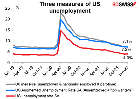
One of the best aspects of the figure was the rise in the participation rate. The participation rate fell from 63.40 before the pandemic to a low of 61.40 afterward, or down 2 percentage points. It rose 0.3 ppt in January back to 62.20. In other words it’s regained 2/3rds of the decline. Part of the January rise was due to the benchmark revisions, which changed the BLS’s assumptions about the age of workers and therefore their participation.
Meanwhile, the number of jobs is down 1.6mn. At one point (April 2020) the US was down 25.44mn jobs! This is what people forget when they complain about inflation. Which is worse for an economy: 7% inflation or 25.44mn unemployed persons? No question in my mind.
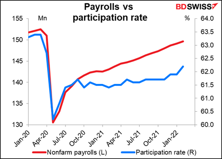
The unemployment rate ticked up, but that’s because of the rise in the participation rate. That’s a good thing. And the U-6 unemployment measure, the broadest measure of unemployment is almost back to its pre-pandemic level (7.1% vs 7.0% in Feb 2020) as the number of people working part-time but wanting full-time work fell further to the lowest level since 2001.
What does this mean for the dollar? It will only add to the Fed’s conviction that the US is at maximum employment and make the Committee members more likely to hike rates. As a result there was an increase in speculation about a 50 bps hike at the March meeting, although that has since come down.
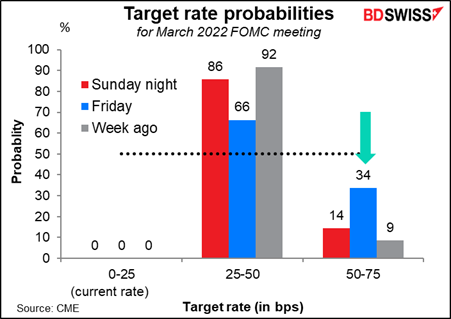
The main impact of last week’s news has been to increase the odds of six or more rate hikes this year.
Such a sharp rise in interest rates could be negative for stock markets. Many people talk about the “Powell put,” the idea being that if stock markets begin to fall the Fed will refrain from hiking rates or even loosen. However, we shouldn’t forget that in May of 2000, with the NASDAQ down 29%, the Fed hiked not 25 bps but rather 50 bps (6.0% to 6.5%) (admittedly the S&P 500 was down only 5% from its peak at that time).
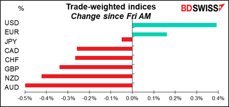
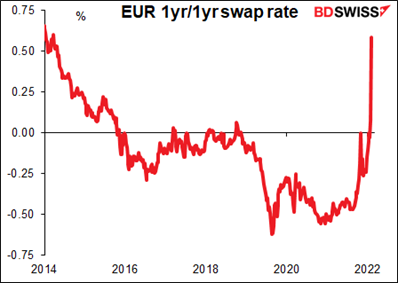
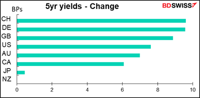
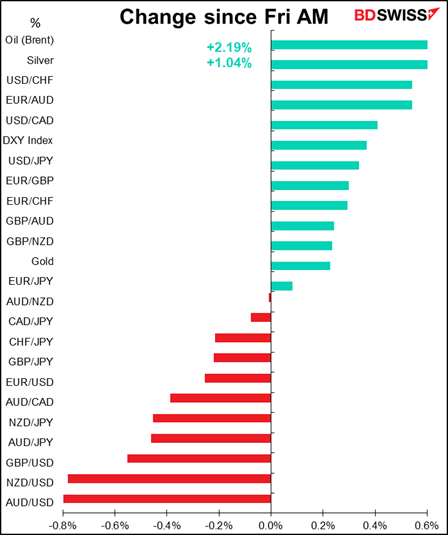
One noteworthy point is that although USD was the best-performing currency Friday, EUR was the second-best. Often these two are on opposite ends of the table as buying one means selling the other. In this case though I think the “Lagarde Shock” is still reverberating through the market after Thursday’s European Central Bank meeting. Her hawkish pivot and refusal to push back on market pricing of a rate hike this year has sent the European rates market into a tizzy. The EUR 1yr/1yr swap rate – the market’s assumption of what one-year rates will be a year from now – lept 58 bps as the market priced in higher yields in the future. By comparison, the standard deviation of weekly moves in this rate is around 8 bps. This was a 7.6 standard-deviation move, which under normal circumstances would simply not happen.
The change in the normally quiet Swiss bond market is also noticeable. Swiss bonds had the sharpest move, both at the 5- and 10-year maturities. (New Zealand was closed for a holiday today.) The assumption must be that if the ECB moves, that will free the Swiss National Bank (SNB) to move too. Switzerland’s policy rate has been steady at -0.75% since 2015! Nonetheless EUR/CHF has moved higher and is now approaching 1.06. Before the ECB meeting it was below 1.04. I would expect the SNB to lag the ECB though and therefore EUR/CHF to move still higher.
AUD and NZD led the declines, presumably on the assumption that faster Fed tightening would mean slower global growth (the “good news is bad news” paradigm).
CAD was weaker despite higher oil prices due to weak employment data on Friday. While the US employment data were surprising on the upside, the Canadian employment data were disappointing: the country lost 200k jobs, almost double what was expected, and the unemployment rate rose to 6.5% vs the expected 6.3% (5.9% previously). I think though that with oil continuing to rise, the CAD/oil relationship is likely to reassert itself today and CAD may recover somewhat.
Commitments of Traders Report
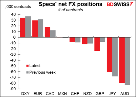
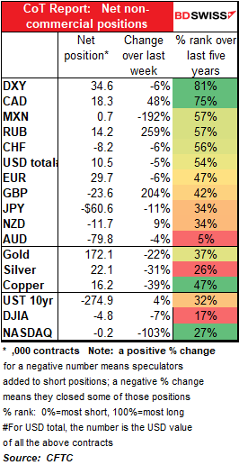
There was little net change in traders’ overall positions vis-à-vis the dollar last week. Traders trimmed their AUD and JPY shorts but offset this by increasing their GBP shorts. They also trimmed their EUR longs but increased their CAD longs.
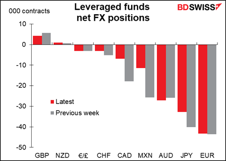
Hedge funds mostly cut their exposure. They trimmed their MXN, CAD, JPY, and CHF shorts while trimming their GBP longs. The only position they expanded significantly was AUD, and even that wasn’t very much.
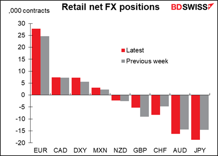
Retail on the other hand added to their JPY, AUD, and CHF shorts as well as to their EUR and MXN longs. They trimmed their GBP shorts however (good call!)
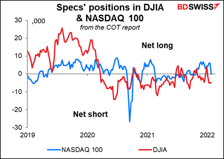
In stocks, traders turned slightly short the NASDAQ 100 index for the first time since October. They’ve been short the DJIA on-and-off since the pandemic began, consistently since the second week in November (except for one week). These are relatively small positions though from a historcal perspective, not at all in line with the dramatic rally in the underlying indices during 2021 (DJIA 18.7%, NASDAQ 100 26.6%).
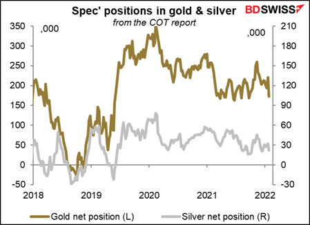
Specs trimmed their long positions in both gold and silver.
Today’s market
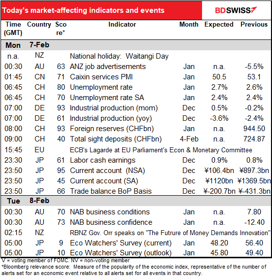
Note: The table above is updated before publication with the latest consensus forecasts. However, the text & charts are prepared ahead of time. Therefore there can be discrepancies between the forecasts given in the table above and in the text & charts.
The major indicators for the European day are already out. German industrial production was much worse than expected, falling 0.3% mom rather than rising 0.5% mom as expected.
I point this out every month, but Swiss foreign exchange reserves are not as good an indicator of the Swiss National Bank’s FX market intervention as the weekly Swiss sight deposits are, as the graph makes crystal-clear. This is because the value of the FX reserve are affected by changes in exchange rate movements whereas the sight deposits aren’t. But people watch the foreign reserve figures anyway.
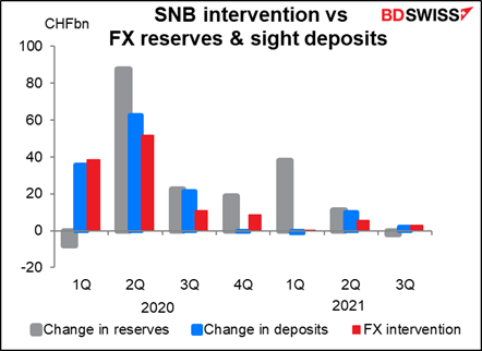
Swiss sight deposits show that the Swiss National Bank (SNB) has stepped back from the market. They only intervened in size three times in December and January. SNB Chairman Jordan last week said in an interview on TV that a stronger CHF had acted as a “bulwark” against rising inflation.
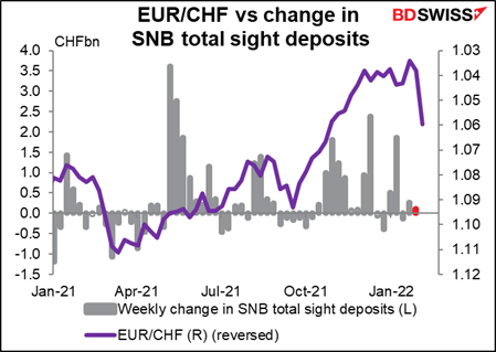
Echoing his comments from the December press conference following the SNB meeting, Jordan expressed comfort with the stable real exchange rate since the pandemic, notwithstanding the nominal appreciation.
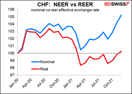
In case you don’t understand the above graph: the “effective exchange rate” is the same as the “trade-weighted index.” It’s a measure of the value of a currency against the major trading partners of a country. The weights used for the index are the percent of trade done with each country. The “nominal” effective exchange rate is just the change in the exchange rate as you see it. The “real” effective exchange rate adjusts for the different inflation rates of both currencies.
What does this mean in practice? Let’s say CHF 1 = USD 1 (close enough). Let’s say there’s a widget that costs $1 in the US and CHF 1 in Switzerland today (actually it would probably cost CHF 2 because everything in Switzerland is crazy expensive, but never mind.) Let’s say the US has 7% inflation (as it does today) and Switzerland 1.5%. That means in one year, the US widget will cost $1.07 and the Swiss widget CHF 1.015. In order for them to still be priced the same in both currencies, the USD/CHF rate has to fall to 1.015/1.07 = 0.9486. In that case, the nominal value of the CHF is appreciating but the real value, i.e. after adjusting for inflation differences in both countries, isn’t. And if USD/CHF stays unchanged, then the nominal value would be steady but the real value falling.]
That’s about it for the European and US days.
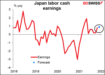
Once Japan comes in, we get Japan’s labor cash earnings. I had hopes that this would be a big indicator back when people were looking for higher wages to start a wage/price spiral that would push Japan’s inflation rate up, but it ain’t gonna happen any time soon. So I present this graph just out of habit.
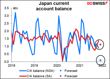
Japan’s current account is a more important indicator. For some inexplicable reason the market tends to look at the forecasts for the not-seasonally adjusted figure, not the seasonally adjusted figure, probably because for decades the Japanese didn’t use the standard seasonal adjustment program and so their seasonal adjustment process wasn’t that great. They use the standard version now but it’s just the habit in Japan to look at the NSA figure.
The NSA figure is expected to be down sharply, but as you can see, that would translate into only a small decline in the seasonally adjusted figure. Nonetheless it would be a plunge from the like year-earlier month (JPY 106bn vs JPY 1.117tn).
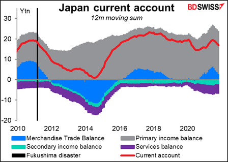
What’s causing the fall? As you can see, trade is just a minor part of Japan’s current account balance. Most of it is the primary income balance, which is mostly income from stocks & bonds. It’s natural that as many countries cut their interest rates to zero and below, Japan’s income from its overseas portfolio investment was likely to fall.
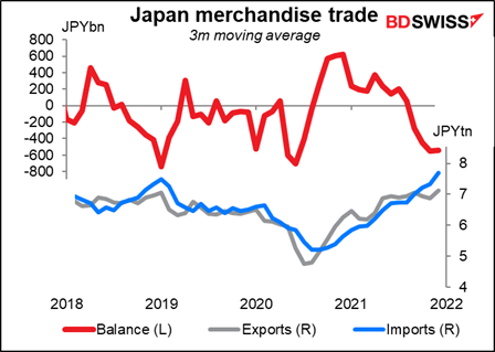
Although it’s also true that the country’s merchandise trade has fallen deeper into deficit as the price of imports (raw materials) has risen but the price of Japan’s exports (finished goods) hasn’t.
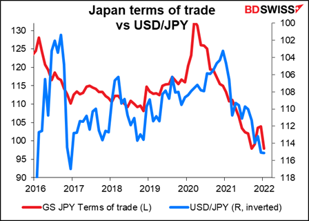
What that means is Japan’s terms of trade (the cost of what it sells abroad relative to what it buys abroad) have been going down ever since the pandemic began. That’s a recipe for a weaker currency.
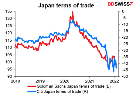
The relationship between the terms of trade and the yen’s value isn’t one-for-one by any means, but it does tend to hold over the longer term. (“tend to hold” and “over the longer term” = no good for making trades on a normal traders’ time horizon.)
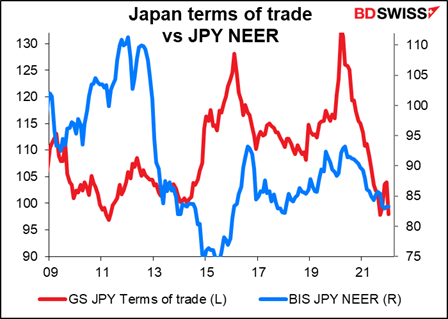
It also holds specifically for USD/JPY over certain time periods (but not all – I’m not going to show you those however).
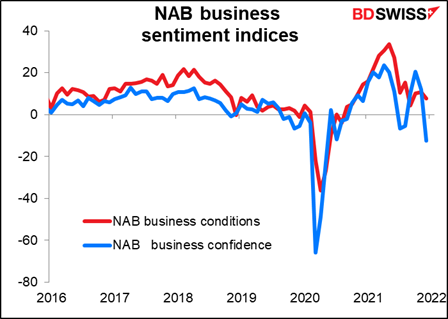
There are no forecasts for the National Australian Bank (NAB) business conditions & business confidence indices, but since they have Bloomberg significance ratings over 70, here’s a graph of them anyway.
Source: BDSwiss